

I like to think that I am an expert on comic books. I know all the characters and the artists and the story arcs and the histories. It's one of those things that I actively try to learn more about on a daily basis. I own 12,000 + hard copies with a thousand of those being graphic novels. I was there since the late 70s and I bought most everything for 30 years. I have read thousands of various on the same basic story themes.
For that reason I like to see any new cover, especially when the cover is for a new look or direction for a comic company. NOW is the new mainstream Marvel comic line. It debuts in November. These covers were released today and I had some thoughts.
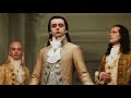
The perspective on the first piece is really off putting...unless you want to have Captain America's crotch front and center. I also don't really want to see the inside of his shield, especially on the cover. The Shield is visually spectacular and iconic and you don't want to hide it's impact on your first book out the door.
Don't get me started on Thor's Helmet. It looks ill-fitting and restrictive to his sight. Plus his face looks strange and oft putting. Thor also seems smaller than he should be - like they shrunk him to make him fit the forced perspective.
The Black Widow gets lost by having her bodysuit be the same color as Thor's tunic. He could have been colored a bit lighter blue to create more contrast between the two characters. Her web stingers look like his codpiece. I don't like the juxtaposition of elements.
I love the Yellow Iron Man, however. He's like a shiny metal bumbly bee. I hope he has a sting like new power to his armor. Most upgrades have come with new abilities. Stark is a futurist so I want to see that in his armor.
I enjoyed seeing Spider-Man on the cover. It gives me hope that he will show up in the the live action Avengers 3 in a few years. They seem to be sticking with the idea of Spider-Man as a part of the Avengers. That idea was a LONG time in coming to the comic books but it makes so much sense.
Spider-Man may be misunderstood by the general public but to his fellow heroes, he is the real deal. It would make sense that he would get the call when things got sticky. I like the synergy that Marvel has going on with NOW. They are connecting everything to one Universe that can be sold over multiple platforms. The toys, comics, cartoons, movies, ect...all share one history and vision.
Will this work or will it explode in their faces? Who knows. I didn't think Marvel was all that broke to be worthy of a reboot but there it is. I take what they give me and I follow all the characters and arcs that I like. I hope it produces some items of interest. These transformations are never a total failure.
Change is always fun to watch if not always fun to be a part of. In this case the change means that the characters remain in the public's consciousness. The success of the comics won't hurt in carrying the brand between all the live action superhero movies we can expect over the next decade.


%20SDTB.jpg)


7 comments:
You're taking the words right out of my mouth Kal. I agree with everything you said plus I have a few problem so of my own. Black Widow is firing in two different directions, which looks off, also one of guns is positioned right in front of Thor's crotch in the more Fruedian way possible. The guns also hide most of Thor's lower body.
When I saw the new Iron Man armor I wondered if I had missed a story were Hank Pym becomes Iron Yellowjacket or something.
I think my biggest problem may be the Logo. The Dead Center placement looks AWFUL! It takes up a full third of cover and all it communicates is "A" since "Avengers" in in such a tiny font! It amazes me that a layout this bad was approved by professional artists and graphic designers!
I can kinda like the idea putting the writer and artist and company name at the top center like a movie poster puts its star names and studios at the top. But I think the title and issue number need to be next to each other for easy recognition and identification.
I agree. Way too much style and not enough realism.
when I was going to the Kubert school...I was taught certain things about composition and placement and spotting that artists today just outright defy.
For example...the suit over suit deal in the Widow and Thor drawing
Then there was the ( Equal time ) element...Now...you'd think that each of these covers represented...CAP as the star of the book...or WIDOW or IRON MAN...everyone else is lost. They should go back to HOW TO DRAW COMICS THE MARVEL WAY and stick to it. Realistic drawings are cool but it depends on how you use them.
The most important factor is over rendering. It's a comic book not a movie poster...as movie posters go...these would stink much less as comic book covers.
As they break all the established rules...rules I look for when reading new material. The storytelling leaves a lo9t to be desired too as the sequential art aspect seems to be not so important these days. Not to say...artists today are not good...they are. It's the editors fault...they let things go.." Cuz it's cool man!!! " well that's BULLSHIT!" know what's cool? Pick up an issue of any comic book Marvel OR DC put out in the 70's. In my opinion in many cases...match up an old book to a new book and the old one kicks it's ass and sends it home crying.
It's a shame really. BUT the good thing is...the old saying goes. " What was once old will once again be new. " I wait patiently for the right editors to take charge. At least we got rid of Liefield eh?
Liefeild isn't done yet. He is a cockroach that needs to be squashed by the collective boot of mankind.
And don't forget how high Jim Lee has scuttled. The Imagification of DC proceeds...
Marvel won't rest til they've killed everything that used to be cool about thir comic books.
Post a Comment